/ 12
ZORA
Brand identity · coffee roasteryConcept
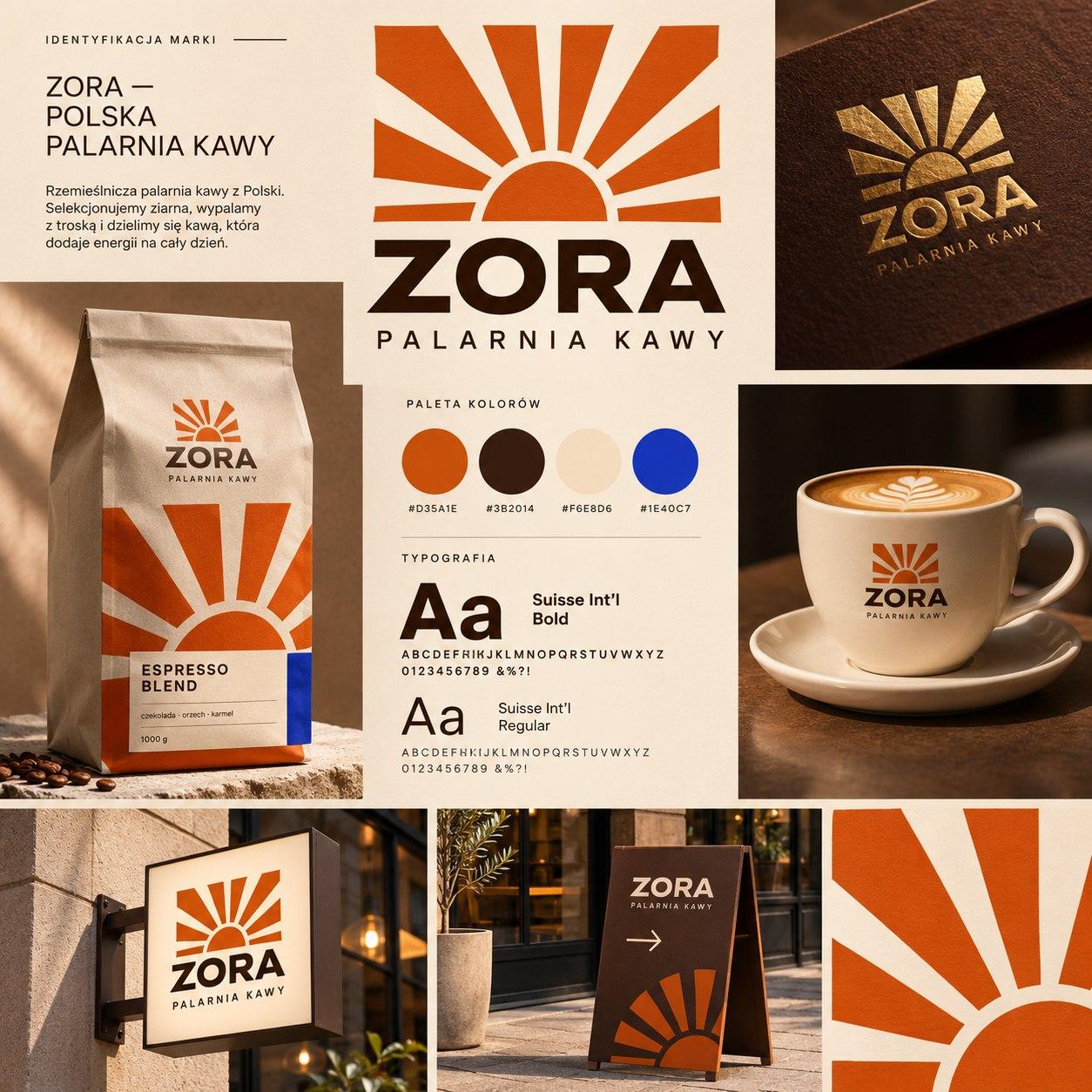
A brand identity concept for a coffee roastery: a rising-sun mark, gold foil, packaging, cups and storefront signage.
- Role
- Concept / Branding / Design
- Tools
- Photoshop · Illustrator · AI tools
- Year
- 2026
- Reading
- 2 min
[ 01 ]
Challenge_
A small roastery competes with chains and dozens of look-alike minimalist brands. It needed a mark you can recognise from across the street on a sign and up close on a bag — one that can carry a premium line without a separate identity.
[ 02 ]
Audience_
People aged 25–40 who drink speciality coffee deliberately and come back to places with character — the brand has to feel warm and crafted, not hipster.
[ 03 ]
Overview_
ZORA is a coffee-roastery brand concept built around a single mark: a rising sun.
What's inside
- 01
One mark, three roles
The sun works as the logo, a packaging pattern and a sign icon.
- 02
Gold-foil logo
The mark finished in gold foil.
- 03
Coffee bags
In orange, brown and blue.
- 04
Cups and the shop
Branded cups, a projecting sign and an A-board.
- 05
Simple typography
Geometric, so the mark leads.
[ 04 ]
Process_
01Decision
One mark
↳ instead of
a set of iconsthe rising sun works as the logo, a repeat pattern on the bags and the silhouette of the sign, so the brand is recognisable even without its name.
02Decision
A warm palette of orange and brown with one cool blue accent
warmth reads as roasted coffee, while the blue makes the bag stand out on a shelf full of browns and separates the variants.
03Decision
Gold foil on paper
↳ instead of
a separate premium linethe same bag and the same mark — one finishing touch signals the higher price point, not a new design.
04Decision
Simple geometric type
the name and copy step back for the mark, and short flavour labels stay legible from shelf distance.
[ 05 ]
Gallery_
01 — Presentation board 02 — Gold-foil logo 03 — Coffee bag — Espresso Blend 04 — Branded cup 05 — Storefront sign 06 — A-board
[ 06 ]
Outcome_
A visual system shown on a presentation board and in applications. Visualisations prepared with the help of AI tools.
[ 07 ]
Details_
Tech & tools
- Photoshop
- Illustrator
- AI tools
Concept project: identity and visualisations prepared for the portfolio.
Next project
NOMA