Kraków / Poland
2026
ENPL

Kraków / Poland — 2026

← Back to archiveProject record / 002

Example brief / Placeholder / 2026

Plain

Discipline
Digital / UI
Role & scope
Product direction, interface design, component system.
Plain: An example planning product for small teams, organised around one clear view of the week.

01 / Context

Plain

An example planning product for small teams, organised around one clear view of the week.

02 / The problem

The example brief: help a small team see commitments, available time and the next task without switching between several views.

03 / Design rationale

Design is decision.

A proposed response to the example brief.

Decision 01Hierarchy

Alternative
A dashboard full of summary metrics would give every item similar weight.
Direction
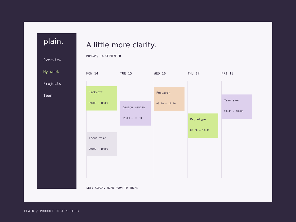
Make the week the primary view, with one persistent navigation column.
Effect
Time and commitments become the first information visible on the screen.
Decision 02Components

Alternative
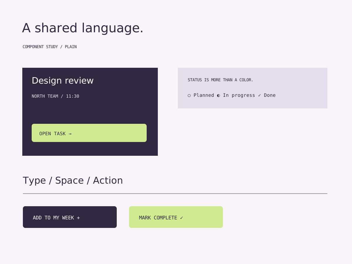
Color-only task states would be ambiguous and less accessible.
Direction
Pair color with a written status and keep the next action on each task card.
Effect
State and action remain understandable without relying on hue alone.

Decision 03Mobile

Alternative
Shrinking the five-column week would make tasks too narrow to read.
Direction
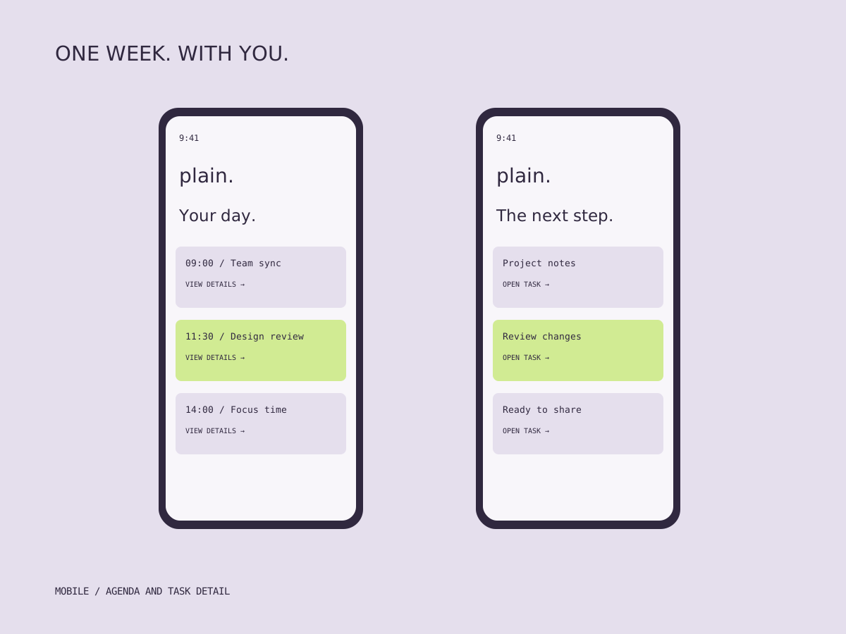
Use a single-column daily agenda and a separate task detail on mobile.
Effect
The same content keeps a clear order within a smaller screen.

04 / Visual system

One visual language.

Components

Navigation, task cards, status labels and primary actions form a small reusable vocabulary.

Palette

Deep plum for structure, pale lilac for surfaces and lime for the next action.

Responsive logic

A shared week on desktop becomes a daily agenda on mobile. The information order stays intact.

05 / Applications

From system to surface.

Plain sample mobile screens showing a daily agenda and task detail.
01 / Mobile agenda and task detail
Plain interface components: task card, written status labels and action buttons.
02 / Component and state study
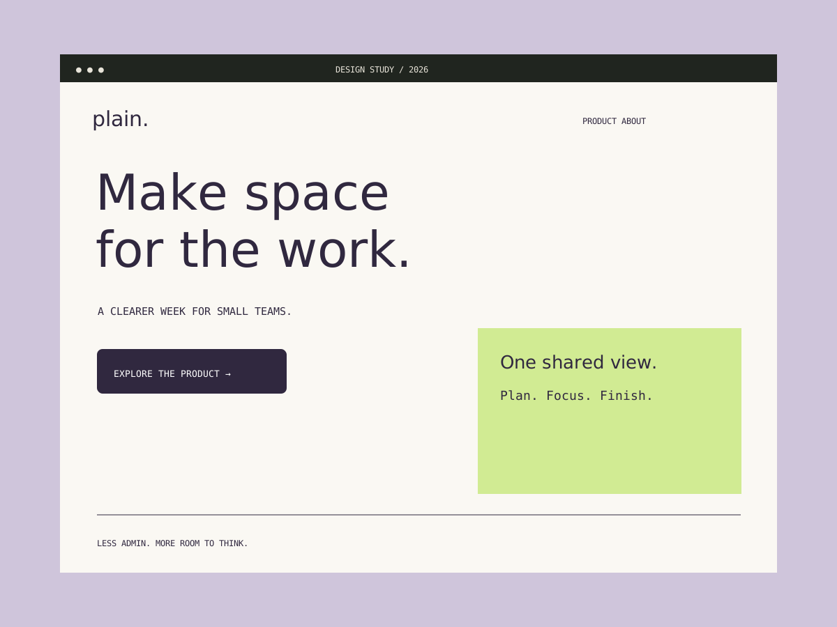
Plain sample product landing page in plum, lilac and lime.
03 / Product landing page

Details

A closer look.

Each status has a word as well as a visual cue. The examples show the intended interface language; they are static design studies, not a live application or a tested product.

Result / Outcome

The example deliverables.

Example deliverables: a weekly desktop view, mobile agenda, task components and a landing page. No user research results or product metrics are claimed for this placeholder.